Saturday, December 26, 2009

Cowboy Life Drawings (last class before holidays)


Structure and I aren't the best of friends...

Thursday, December 24, 2009

Merry Christmas from a very friendly Santa Claus


Cool lighting is definitely another animal. It is way too easy to make skin muddy. Texturing was fun though. I'm going to start using texture brushes more often. Trying to find a way to incorporate textures with more cartoonish drawings...

Time to do more studies. Until next time, Merry Christmas (and Merry "the other billion holidays celebrated around this time") and say hi to this Santa if you see him!

Monday, December 21, 2009

Thursday, December 17, 2009

Dual Image Paintings


I forgot it was one of the criteria to change the colour palette between the paintings. Though I did that, it is very very slight, enough for Maureen and others to call me out on that. I went with an idea that's more subtle but it is perhaps too subtle for this assignment...

Maureen stated that my palettes are always looking towards the warm side and I agreed completely. Expect paintings during the holidays where I go the opposite direction.

Each is 9x12" Gouache on Cold-press Watercolour paper

Mood Landscape: Hong Kong 2146 A.D.


I think the wonky perspective is way too bothersome but it could be something else that makes me dislike this piece. I don't really know... Some people liked the wackiness of the concept. I wasn't one of them.

Somebody also called me out on the horrendously ugly signatures I put down. I've removed them for my next assignment.

10x15" Gouache on Cold-press Watercolour paper

Thursday, December 3, 2009

Detective Fleabottom

Gosh, I suck at creating interesting characters... Bugged Enzo far too much for this one.

Thursday, November 26, 2009

Cloud Painting

All about the temperature for this one.

Tuesday, November 24, 2009

WIP: Feeding Coalition

Trying something completely new in this one, subject matter and rendering wise.

Slightly inspired by Royal Winter Fair and how savage the llamas were in the feeding area. I lost quite a bit of drawings because a hungry llama decided to take a bite out of my newsprint pad.

Monday, November 23, 2009

Kickass Free Tutorials

http://b.static.ak.fbcdn.net/rsrc.php/z4HBM/hash/3krgnmig.swf?v=181919819370&ev=0

This was done by user jason_maranto at conceptart.org. Very helpful in trying to determine values for the sake of composition and not always what seems scientific. Analyzes the works of Frazetta as well.

http://www.youtube.com/user/daarken

Daarken is a concept artist working on Warhammer Online who does tutorials in his free time. He sheds light more on Photoshop techniques than art fundamentals, though it's awesome nonetheless.

http://www.conceptart.org/forums/showthread.php?t=148355

Lin Ran's tutorials translated by a user in conceptart. Lin is just godly at painting. I found it revolutionary in how to perceive colours through RGB rather than the usual HSB because the world ultimately works around light reaching our eyes. One of the best free tutorials I've ever read.

A little treat for people who actually decides to click "Alexander Chow" on the Animation blog list :) . Now to cram for today's storyboarding test...

Friday, November 6, 2009

"Layouts" and Ninja Girl Coloured


I did not know what to do with layout assignment 2 quite honestly, so I did what I thought Komza meant. Hopefully it's close enough...

Monday, October 26, 2009

Samurninja


For those who follow the UFC, I couldn't stop thinking of Shogun's fight last night. The judges must have had Solid Snake stealth because they wouldn't have gotten out the stadium alive otherwise.

The thought kind of led me to doing this for some odd reason. I decided to place many materials of different properties which makes for excellent practice. Initial silhouette is provided as well. I was thinking of placing a dead dragon behind her but this piece is cheesy enough as it is.

EDIT: Woke up and realized how stupidly revealing it was on the leg area. Fixed.

EDIT2: Leather looked like cloth. Cloth looked like leather. Fixed.

Saturday, October 24, 2009

The Goliath


This is a character for my upcoming bigger painting. I wanted to experiment with specularity and how much of it is needed in order to show form for metals. The classical test to find the balance between lighting theory and what looks good in art came to play yet again...

Inspired by gorillas and Monster Hunter.

Pendulum


Won the award for worst background in the history of Sheridan animation pendulums.

Bowling Ball

Rubber Ball


Tried to exaggerate the squash and stretch for this one.

Balloon


This was hell. I don't even want to know how many trees I used up for this one.

Sunday, October 4, 2009

Sunday, September 27, 2009

WIP: The Cardmaster


Multiply layers are just friggin' awesome for determining how coloured illumination works on various local hues. Just decided to give it a test run after realizing my scanner isn't big enough to scan my character rotation anyways. Consistent lighting on various materials is the focus for this one.

My anatomy needs a ton of work but hopefully I can go to extra life drawing everyday soon.

This is a WIP though it would be a miracle if I find a way to work on this in preparation for the dreaded Week 5.

EDIT1: Quick hair touch-up; silhouette reminded me of an afro... EDIT2: Completely redid the drawing portion and rendered it again. Couldn't believe how stiff it looked.

Saturday, September 19, 2009

Streamlining the Process


Thanks to this thread, I have been practicing trying to quicken my painting process. Read it for more info. Needless to say, it worked. This only took 4 hours as opposed to my "Bad Day at Work" which took more than 15 hours.

I wish my drawing was better though. I spent most of my time fixing my damn drawing. Gonna have to fix that back leg as well.The 4 icons are placeholders since I'm not sure what I'm going to put in them yet. Excuses excuses excuses!

I still have a long way to go to make things perfect on the first try like Jason Chan does.

This is for Tuesday's Digital Tools assignment. I'm going to waste a ton of ink printing this one!

EDIT: Fixed perspective. EDIT2: Fixed back leg. EDIT3: Decided to use a colour balance layer only because of a fatal mistake that ruined the colours. It looks kinda oversaturated on this computer but pretty okay on the school ones. Hmmm...

Friday, September 11, 2009

CLICKCLICKCLICKCLICKCLICKCLICKCLICKCLICKCLICKCLICKCLICKCLICKCLICKCLICKCLICKCLICKCLICKCLICKCLICKCLICKCLICKCLICKCLICKCLICKCLICKCLICKCLICKCLICKCLICKCLICK

Painting done with a mouse during Tuesday's digital tools class. I swear I was listening in class! Hopefully it looks like who I intended it to be.

Monday, September 7, 2009

"Look, ma! No adjustment layers!"


Rendering the crap out of something is such a great time waster. I'm completely fresh out of new ideas, though. I'm just too excited for Sheridan.

Didn't turn out that bad considering I pulled the colours out of my ass. I'm not liking the armour though; looks like if Claymore was given a dose of marijuana.

EDIT: 1 am, tired as hell, but damn, the armour annoyed me far too much for me to sleep. Improved it by a little.

Friday, September 4, 2009

MASSIVE Inspiration

Massive Black has dumped a ton of works this week and they're looking sweet.

http://conceptart.org/forums/showthread.php?t=53087&page=67

Thursday, September 3, 2009

Subtle Values


Recently watched Zhang Lu's Caucasian Female Portraits and I am amazed of how subtle values can transition in order to create form. These were done in around 1 hour each with referencing and studies from Zhang Lu's portraits and other photos. The second picture is just me screwing around with characters I saw at Fan Expo to make studying more exciting than it is. Insane how a half value difference can mean so much.

Monday, August 31, 2009

Plan Ahead...


Incomplete and probably won't go back to it. Promising myself I will never render out characters fully before starting the background. The contrast of values is way too high for the background I had in mind. Low key figures on a high key background = recipe for disaster. Sigh. At least it was a good test with the Rembrandt palette.

And Mr. Mayerson really put me up on http://sheridananimation.blogspot.com/ a little too early, though not really much of a problem. Thanks!

Sheridan Portfolio 2009

Found these laying around for awhile so I edited an old redundant post in exchange of putting my entrance portfolio for everyone to see.

As a backstory, as far as I know from asking around, I received the lowest mark of the year before my appeal for a reevaluation (rank 25 on the waiting list). This means that anything here is literally the minimum anyone should possibly aim for.


Monday, August 24, 2009

Based on a True Story...


...despite how stupid it seems to be. You can't make this shit up, quite honestly.

This was an excuse to use some of the designs I had in mind after studying a bit of fashion. Based on my previous post's chart, this will garner 10000 views on Deviantart!

Changes will be coming. I'll be posting this in the Critique Center at CA.org soon.

EDIT: Added atmospheric perspective on the electric fan, made the cloth on her head more obvious, and added motion blur to the fan (not sure about this one).

EDIT2: Made the colours dance a lot more. EDIT3: More dancing...

Wednesday, August 19, 2009

Funny Picture


I didn't make this though it sums up why I'm not the biggest fan of DA.

Tuesday, August 18, 2009

Walking the Bear


Just trying to apply some of the concepts in the CA.org lectures... One of the few pictures I did not completely wreck with adjustment layers.

I didn't really bother with details because I realized how cartoonish the colours were midway the process and didn't like it. Learned a thing or two, but now it's time to move on.

Friday, August 14, 2009

Quick Sketch

Juggling between Vilppu, CA.org's Colour Theory lecture, and the Art of Composition lecture has left me with little time to actually screw around Photoshop. I decided to do something fun in awhile.

Tuesday, July 21, 2009

Bad Day at Work (hopefully final)


Learned a lot from this but I felt the process was too sloppy. Colours, in particular, took too many adjustments.

On to my next one!

Saturday, July 18, 2009

Colour Temperature Study

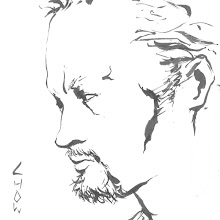
Photo referenced (duh)

I was particularly intrigued when I stumbled upon the photograph. It has a soothing warmth that is immediately shifted where the fluorescent lights appeared. Excellent way to study colour temperature. I'm probably going to make an original piece based on this environment.

Friday, July 10, 2009

Critiqued

It's weird how it takes other people to point out obvious flaws.

Some notes to make so I don't forget (regardless if anybody actually checks out this blog or not):

-Everything was too muddy.
-Skin looked oiled.
-Hands awkward.
-Midway through this edited version, the skin was too yellow. Skin leans towards red as a local colour. Add the environment's yellow light and it should look good orange-tinted.
-Reference when doing realism.
-Contrast is ultimately determined by the intensity of the main light versus the secondary light(s). There is no such thing as the perfect contrast. It's relative to the environment.

More edits to come.

Wednesday, July 8, 2009

Rendering Crap


Why do I always fall down the same traps over and over again?

I am not very happy about this one because there were way too many drawing mistakes which I only noticed midway my colouring. The biggest one by far is the proportions of the head. In the grayscale version, the head was massive compared to the body, and the face was way too wide. In other words, it looked way too much like me. On the bright side, I did "grim" it up to fit the mood better.

I tried to play with a new colour scheme and changed the way I think about colours. On the colour side of things, it isn't absolutely atrocious. I wished the drawing was better though. I also need to find a way to render skin without making it look too smooth.

I'm going to have to slap myself next time I make a head too wide. I might have to tap into photo referencing soon as well. I'll leave imaginary drawing to cartoons.

Fresh Eyes


What happens when I don't use reference? I make people look like me. I kind of laughed when I woke up this morning and realized the businessman looked way too much like me. I fixed it.

I also made the composition slightly less cluttered. Colours later today, tomorrow, or never.

EDIT: In the midst of my colouring, I realized I fell for the same trap again. Too much contrast! I realized it's because I'm considering most of my half tones to be shadow which creates awkward form.

Tuesday, July 7, 2009

Bad Day at Work


The composition and idea were huge time consumers. I also had to study many photos with rain which was much harder than I initially thought. For example, because the tuxedo absorbs water, there wouldn't be droplets, while the face and, to some extent, the tie would have them sliding on the surface.

Please click for maximum resolution. The textures cannot be seen in the thumbnail. Took around a week of studies and 6 hours of drawing and painting. No references on the man himself.

I'll probably have to do a more interesting lighting next time. There is a good chance I will be enlarging this and putting his entire body in. The composition doesn't sit well with me.

Thursday, July 2, 2009