Tuesday, July 21, 2009

Bad Day at Work (hopefully final)


Learned a lot from this but I felt the process was too sloppy. Colours, in particular, took too many adjustments.

On to my next one!

Saturday, July 18, 2009

Colour Temperature Study

Photo referenced (duh)

I was particularly intrigued when I stumbled upon the photograph. It has a soothing warmth that is immediately shifted where the fluorescent lights appeared. Excellent way to study colour temperature. I'm probably going to make an original piece based on this environment.

Friday, July 10, 2009

Critiqued

It's weird how it takes other people to point out obvious flaws.

Some notes to make so I don't forget (regardless if anybody actually checks out this blog or not):

-Everything was too muddy.
-Skin looked oiled.
-Hands awkward.
-Midway through this edited version, the skin was too yellow. Skin leans towards red as a local colour. Add the environment's yellow light and it should look good orange-tinted.
-Reference when doing realism.
-Contrast is ultimately determined by the intensity of the main light versus the secondary light(s). There is no such thing as the perfect contrast. It's relative to the environment.

More edits to come.

Wednesday, July 8, 2009

Rendering Crap


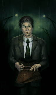
Why do I always fall down the same traps over and over again?

I am not very happy about this one because there were way too many drawing mistakes which I only noticed midway my colouring. The biggest one by far is the proportions of the head. In the grayscale version, the head was massive compared to the body, and the face was way too wide. In other words, it looked way too much like me. On the bright side, I did "grim" it up to fit the mood better.

I tried to play with a new colour scheme and changed the way I think about colours. On the colour side of things, it isn't absolutely atrocious. I wished the drawing was better though. I also need to find a way to render skin without making it look too smooth.

I'm going to have to slap myself next time I make a head too wide. I might have to tap into photo referencing soon as well. I'll leave imaginary drawing to cartoons.
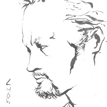
Fresh Eyes


What happens when I don't use reference? I make people look like me. I kind of laughed when I woke up this morning and realized the businessman looked way too much like me. I fixed it.

I also made the composition slightly less cluttered. Colours later today, tomorrow, or never.

EDIT: In the midst of my colouring, I realized I fell for the same trap again. Too much contrast! I realized it's because I'm considering most of my half tones to be shadow which creates awkward form.

Tuesday, July 7, 2009

Bad Day at Work


The composition and idea were huge time consumers. I also had to study many photos with rain which was much harder than I initially thought. For example, because the tuxedo absorbs water, there wouldn't be droplets, while the face and, to some extent, the tie would have them sliding on the surface.

Please click for maximum resolution. The textures cannot be seen in the thumbnail. Took around a week of studies and 6 hours of drawing and painting. No references on the man himself.

I'll probably have to do a more interesting lighting next time. There is a good chance I will be enlarging this and putting his entire body in. The composition doesn't sit well with me.

Thursday, July 2, 2009