Why do I always fall down the same traps over and over again?
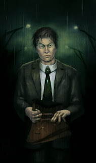
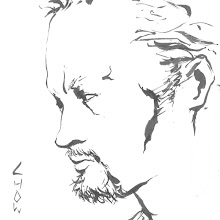
I am not very happy about this one because there were way too many drawing mistakes which I only noticed midway my colouring. The biggest one by far is the proportions of the head. In the grayscale version, the head was massive compared to the body, and the face was way too wide. In other words, it looked way too much like me. On the bright side, I did "grim" it up to fit the mood better.
I tried to play with a new colour scheme and changed the way I think about colours. On the colour side of things, it isn't absolutely atrocious. I wished the drawing was better though. I also need to find a way to render skin without making it look too smooth.
I'm going to have to slap myself next time I make a head too wide. I might have to tap into photo referencing soon as well. I'll leave imaginary drawing to cartoons.

No comments:
Post a Comment